How NOT to make visualizations | FlyingArchitecture

What heathens we are! Admit it - we’ve all committed some of these CGI crimes at least once.
10. Ultra-wide camera angle
When your client asks you to make the camera angle wider... and wider... and wider... wanting to capture the whole interior and, if possible, even the exterior in a single image, you know something is wrong. They pay you per image, so they want to get the most for their money. Artistic approach, composition, idea behind the image, and storytelling be damned! Just make it wider!
09. Watermark
Covering half of the image with your email address and/or telephone number just isn’t an effective way to advertise or protect your artwork... it just doesn’t work. You’ll just end up distracting the viewer away from the artwork.
08. People
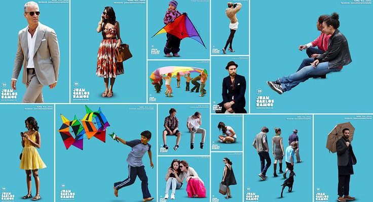
There are a couple ways to fail in using people assets:
Shiny happy people
Your images are full of commercial s**t, like a happy cheering crowd on a new, 50x50m concrete platform. What made them happy? Being in the image? The concrete itself? If you are going to use such happy people, give them a reason to smile. Create a story.
People staring at the photographer
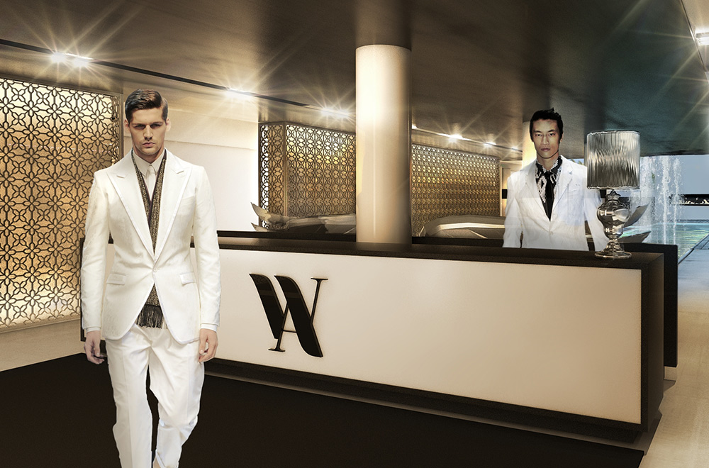
Simple. Don’t show the fronts of their faces, don’t make them look at you. It just leaves the observer feeling embarrassed, stressed, confused, guilty and weird. That’s not a feeling you want your client to have. Become invisible as a photographer, don’t clue anyone into your presence. Be a ghost—an invisible, calm viewer.
Architect - Tech Writer - 3D Artist - 3D printing enthusiast


